UI5 Web Components 是 SAP 提供的 Fiori UX 风格的 Web Components, 可以用在主流的 JavaScript 框架 (Angular, Vue, React) 上。
本篇基于 Angular - Setup Dev Project 进行开发, 本篇代码 Github
Step 1. Install
npm install @ui5/webcomponents --save
Step 2. Change Button to UI5
上一篇我们使用到了 HTML 原生的 button 给用户点击,有了 Web Components 我们就可以换用更好看的 Button Web Component 了。
首先引入 CUSTOM_ELEMENTS_SCHEMA 然后在 Module 声明中加入 schemas: [ CUSTOM_ELEMENTS_SCHEMA ], 然后引入 UI5 的 WebComponents
import { CUSTOM_ELEMENTS_SCHEMA } from '@angular/core';
// UI5 Web Components used
import '@ui5/webcomponents/dist/Button';

@NgModule({
  declarations: [
      ...
  ],
  schemas: [ CUSTOM_ELEMENTS_SCHEMA ],
  imports: [
    ...
  ],
    ...
})
export class AppModule { }
那么就可以在此 Module 里的任何位置使用引入的 WebComponents 如 ui5-button
<ui5-button type="Default" (press)="share()">Share</ui5-button>
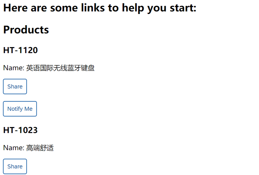
给它的事件 press (相当于 HTML button 的 click)添加监听方法调用 share()。最终 button 的效果如下
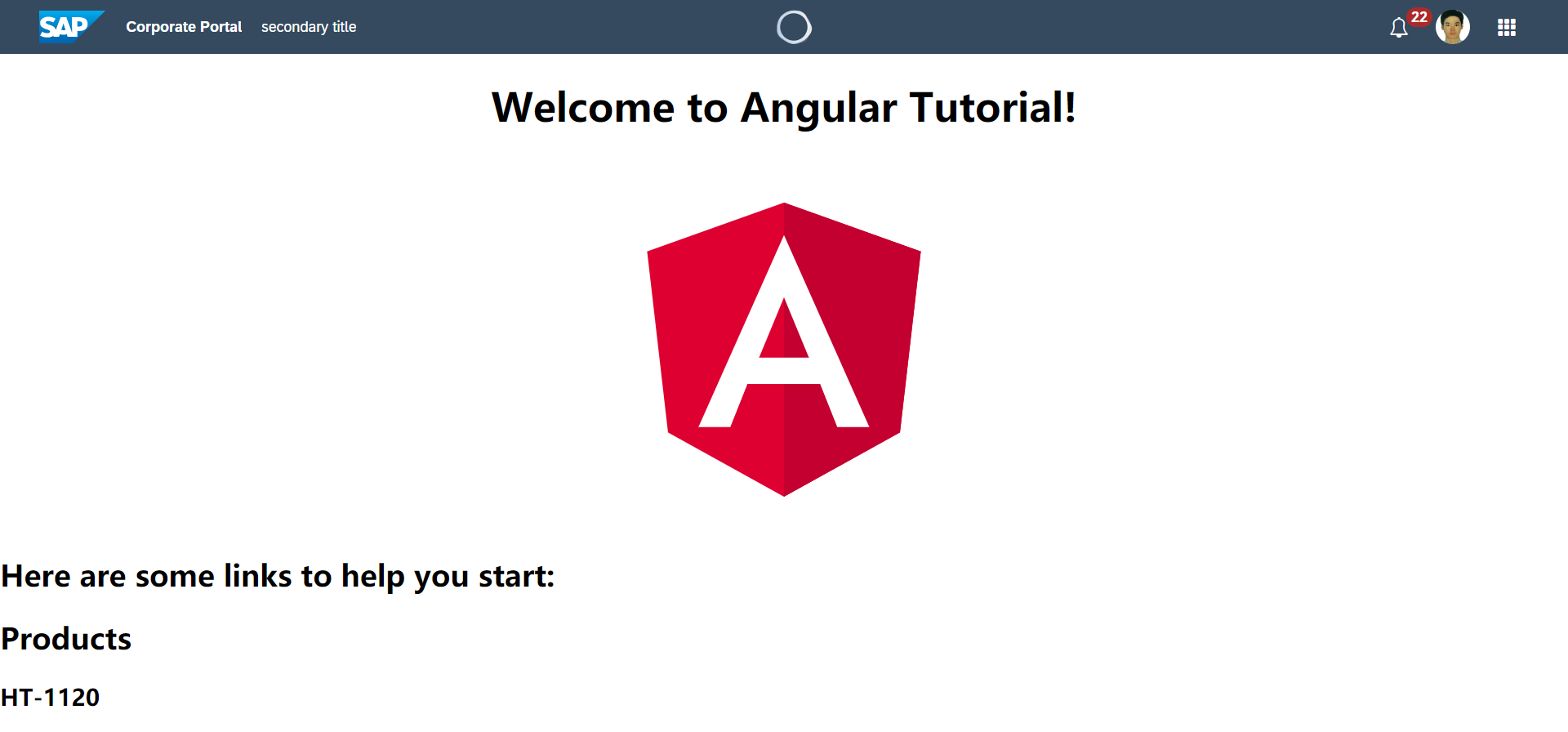
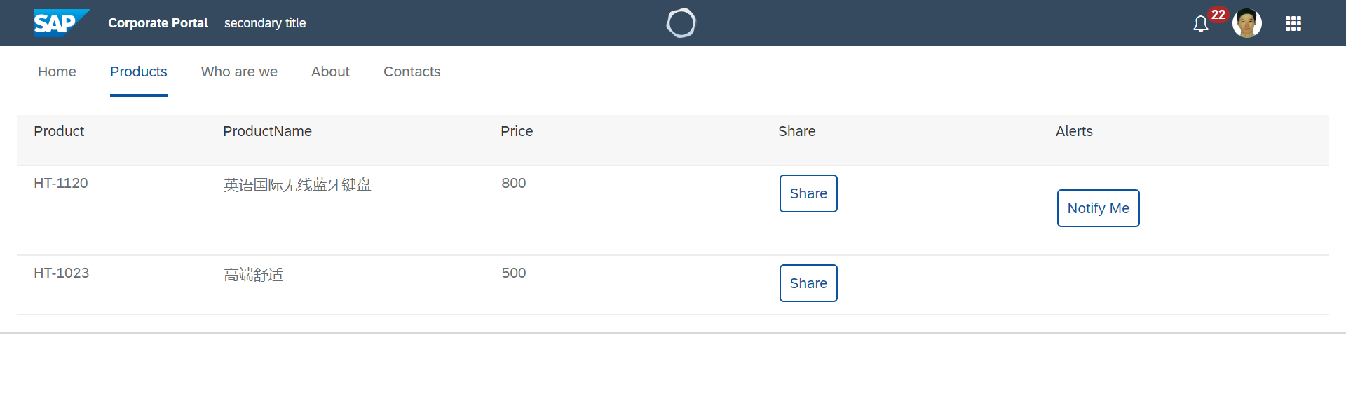
Step 3. ShellBar
为我们的 Angular app 加一个 ShellBar
<ui5-shellbar
  profile="https://avatars1.githubusercontent.com/u/5583445?s=460&v=4"
  primary-title="Corporate Portal"
  secondary-title="secondary title"
  logo="https://sap.github.io/ui5-webcomponents/images/sap-logo-svg.svg"
  show-co-pilot
  show-product-switch
  show-notifications
  notification-count="22"
  >
</ui5-shellbar>
Step 4. Tab
<ui5-tabcontainer class="full-width" collapsed fixed show-overflow>
    <ui5-tab text="Home"></ui5-tab>
    <ui5-tab text="What's new" selected></ui5-tab>
    <ui5-tab text="Who are we"></ui5-tab>
    <ui5-tab text="About"></ui5-tab>
    <ui5-tab text="Contacts"></ui5-tab>
</ui5-tabcontainer>
Step 5. Table
接下来对我们的 Products List 改进,使用 UI5 的 Table 组件进行展示。编辑 product-list.component.html, 改成了 ui5-table 控件,然后把循环数据放在 ui5-table-row 上,每个信息放到每一列上
<ui5-table class="demo-table" id="table_product">
  <!-- Columns -->
  <ui5-table-column slot="columns" width="12em">
      <span style="line-height: 1.4rem" slot="header">Product</span>
  </ui5-table-column>

  <ui5-table-column slot="columns" min-width="800" popin-text="ProductName" demand-popin>
      <span style="line-height: 1.4rem" slot="header">ProductName</span>
  </ui5-table-column>

  <ui5-table-column slot="columns" min-width="600" popin-text="Price" demand-popin>
      <span style="line-height: 1.4rem" slot="header">Price</span>
  </ui5-table-column>

  <ui5-table-column slot="columns" min-width="600" popin-text="Share" demand-popin>
    <span style="line-height: 1.4rem" slot="header">Share</span>
  </ui5-table-column>

  <ui5-table-column slot="columns">
    <span style="line-height: 1.4rem" slot="header">Alerts</span>
  </ui5-table-column>

  <!-- Content -->
  <ui5-table-row slot="rows" *ngFor="let product of products">
    <ui5-table-cell slot="cells"></ui5-table-cell>
    <ui5-table-cell slot="cells"></ui5-table-cell>
    <ui5-table-cell slot="cells"></ui5-table-cell>
    <ui5-table-cell slot="cells">
      <ui5-button type="Default" (press)="share()">Share</ui5-button>
    </ui5-table-cell>
    <ui5-table-cell slot="cells">
      <app-product-alerts [product]="product" (notify)="onNotify()"></app-product-alerts>
    </ui5-table-cell>
  </ui5-table-row>
</ui5-table>
然后再把改造好的 放到 Tab ui5-tab 里
<ui5-tab text="Products" selected>
    <app-product-list></app-product-list>
</ui5-tab>
Comments